The brand I've picked for this assignment is the Blender Foundation, the non-profit organization behind the 3D modeling software, Blender. Blender is the software of choice for many 3D artists, as it's an open-source software and entirely free. While it's been around for a long time and has a huge community behind it, it's not at all considered industry standard like the much more expensive Autodesk Maya or similar softwares used by art, animation, and other industries--that is, until the successful release of the Latvian animated film Flow (2024), which was animated entirely in Blender over the course of five years (Zahed, 2024). Finally, Blender had proven itself to be a viable avenue for animators to take in the industry.
The thing is about the Blender Foundation is that it, again, is a non-profit that only gets its funding through donations. In their 2024 Annual Report, the Blender Foundations says that it "does not wish to sell either products or services, which means it isn’t in competition with its community of users" (Blender Foundation, 2025). For that, the goal is not to market Blender as a brand looking to sell a product. Instead, it's to encourage donations, especially from larger corporations within Blender's targeted industries--that being art, animation, VFX, video games, anything that computer generated imagery and motion graphics can apply to. Blender's community of users are to be kept in mind and respected during an ad campaign, as without them, the software would have no users. But, the target of this campaign would be larger companies and creatives... who have money to give.
A few discussion posts back, I mentioned how a YouTuber I'd been watching prior to this class who discussed how they market their own brand, said to bear in mind a target person rather than a larger audience (Athalie Draws, 2026). For this, the target person I would have in mind would be someone along the lines of this: 30-40 years old. An artist. Probably went to an expensive animation school, got hired at a large company like Disney right out of the gate, and made a film with quirky millennial humor about a kid with big dreams who, by the end of the film, is going somewhere. And this target artist probably lives in LA (Like Every Pixar Film in the past Ten Years, 2016-now). But, this person grew up during a time where the generation of creatives before them were demanding more freedom from their production companies' Standards and Practices--so, it's in their head that they, despite the opportunities they themselves had, would be more than happy to support creatives who don't have those same opportunities (or cash). They probably dislike corporate culture and encourage creative expression. So maybe, they look towards a non-profit like the Blender Foundation to fund the constant development of their software.
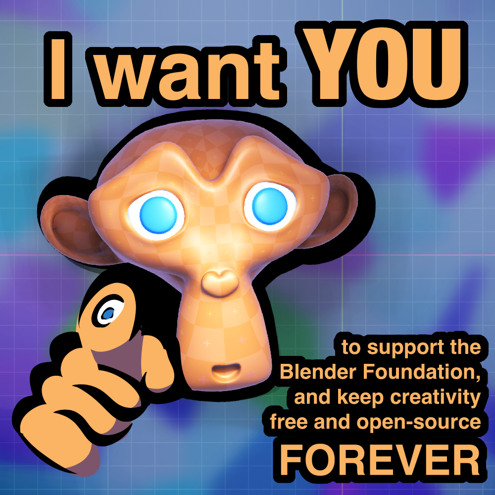
Now I will talk about monkeys. Everyone likes monkeys. The Blender Foundation likes monkeys.
When using Blender, the user is given a few default meshes (these being the wireframe objects that 3D models are built on) to work from. There's the ever suffering Default Cube that spawns in upon each new file being made, there's spheres, spiky spheres, cylinders, donuts, and so on--then there's Suzanne, the monkey. She's the subject of many, many different Blender tutorials that use her as a basis to explain things like subdivision (giving a model more topology to give a smoother appearance), sculpting, UV unwrapping (the process of unwrapping a model like it's made of paper for the purpose of texturing), shading, weight painting (nightmare), and more. She is a very popular figure amongst the community for all of that. That's why I've chosen her as the subject of my Instagram graphic. I've also incorporated Blender's logo, a stylized hand, to act as Suzanne's own hand (initially as a 3D model, until my computer decided that was unacceptable and had a heart attack).
References
Athalie Draws. (2026, April 25). Your Art Is Great But No One Recognizes You (Here’s Why). YouTube. https://www.youtube.com/watch?v=Iz--ayX9FDo
Blender Foundation. (2025). Blender Annual Report — 2024.
Zahed, R. (2024, August 30). “Flow” Director Gints Zilbalodis Sets Adventure Adrift in an Animal Waterworld. Animation Magazine. https://www.animationmagazine.net/2024/08/flow-director-gints-zilbalodis-sets-adventure-adrift-in-an-animal-waterworld/
[tag] adv
# AsparFlakes
June 12, 2026
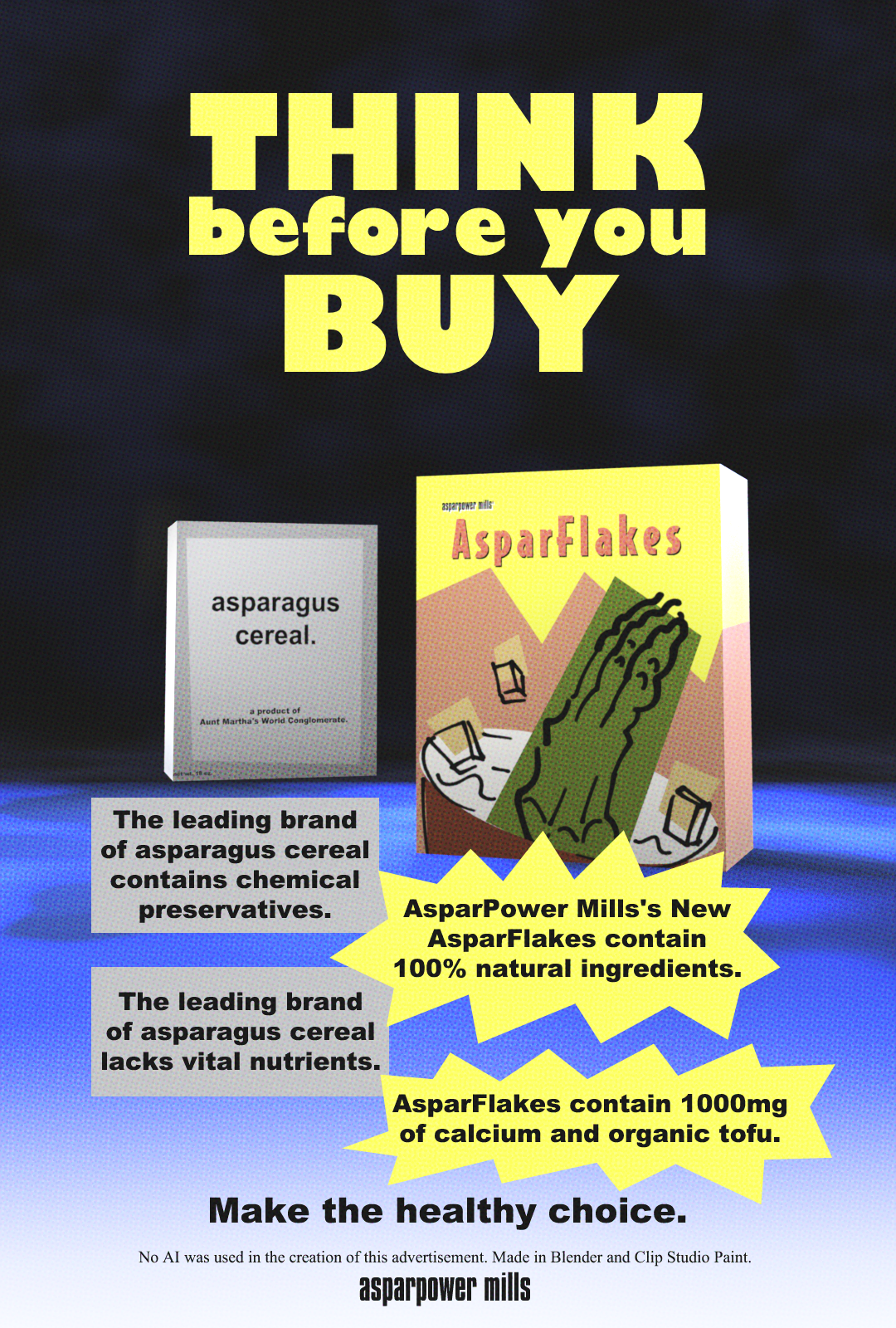
One of my favorite aesthetics when it specifically comes to advertising is 1990s/early 2000s style magazine ads. Maybe it's nostalgia, maybe it's because my work is based in a 90's style. An aspect of that style and era of advertising I can appreciate is just how aggressive it could be. Not like modern-day aggressive advertising, where you can't open a single webpage without an autoplaying ad taking up most of your screen; rather, just the good kind of advertising that tells you, "hey--our competitor SUCKS!" A notable example, obviously, is game company Sega's ad campaign where they just bash Nintendo whenever they can.
Of course, there's a time and place for this style of advertising, and it can have its drawbacks (besides, Sega hasn't even released a console since 1998). Does that mean one can't have fun with it anyway?
Another aspect of this poster that was important to me was the design of the competitor's box. It was not a blind, lazy choice for me to make the box gray and generic--after all, I put the effort into the AsparFlakes box, so it would honestly be dumb for me to just make the other box gray with no purpose. The reason I did this is because the name of the competitor reminded me of two other fictional brands: TF Industries from the game Team Fortress, and MomCorp from Futurama. The former is run by an evil, psychopathic old woman only known as the "Administrator," and includes branding that is very plain, generic, and sterile, even on food products (my source: the spinach can from the game). The latter... is also run by an evil, psychopathic old woman who portrays herself in advertising as a sweet, old motherly woman, despite being the main antagonist of the show. I envisioned "Martha" as being just like Mom and the Administrator; someone who's cold, sociopathic, and may or may not rely on her gender, age, and the preconcieved notions of both her gender and age, to sell garbage products that will probably kill you.
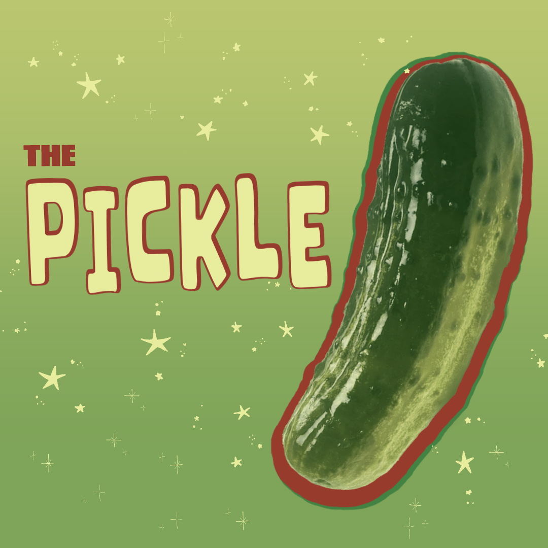
My choice of product for this project, in which we were to make a poster based off any grocery item of our choosing, was the pickle.
I chose a smaller, square format for the poster for a specific reason—it’s because I actually occasionally help my mother with part of her job in a big grocery store chain in NJ, which is graphic design for signs (specifically, signs that are hung in aisles that typically display if an item is on sale, much larger than the individual labels on the shelves). Square is the typical format for these kinds of signs.
I decided that the pickle had its own color scheme that was obviously analogous, with colors that were predominantly green but dipped into a more blueish-green or yellow depending on what part of the pickle you’re looking at. While pickles are typically of a rather dull green color, I used a gradient map within my usual drawing program to add depth to the color scheme, and used the resulting colors as the basis for the rest of the design. Maybe I sorta cheated by just a little bit by also sliding in a complementary color, being a flat red for a pop of interest. I decided to use a gradient in the background, not just to add a bit more depth to what would’ve been an otherwise flat design, but to sell the illusion of a pickle jar (which is accented with the yellow stars), trying to make for an overall fun design.
do_blog.js written by Metemo